Design & Pre-Production
By LuxoPacks Factory Team July 2026
Then comes the email that stalls a surprising number of first orders: "Please send your print-ready artwork on the dieline." If that sentence means nothing to you, you're not alone — and getting it wrong is expensive. Wrong color mode, artwork crossing a fold or missing bleed can create a color shift, a cropped logo or a delayed print run. Check those points on the approved dieline before sending files for production.
This guide demystifies the whole thing: what a dieline is, how to get the right one, and exactly how to hand over artwork a factory can print without guessing.
First: What Is a Dieline?
A dieline is the flat structural template showing the box’s cuts, folds and glue areas. Use the revision confirmed for your finished dimensions rather than scaling a downloaded template. An attractive layout on the wrong panel map can create a correctly printed but incorrectly assembled box.
- Cut lines — the outer edges where the die trims the board (usually a solid line in one spot colour).
- Fold / crease lines — where the board bends to form the box (usually a dashed line in a second spot colour).
- Glue tabs — flaps that bond the structure together, which must stay clear of artwork.
You design your artwork on top of this template so that, once the flat sheet is die-cut and assembled, your logo lands on the lid, your pattern wraps the sides, and nothing important disappears into a fold or a glue seam.
Rule #1: ask the factory for the dieline. Don't build your own from guessed dimensions. The factory generates the exact dieline for your specific box style and size — including the material thickness and wrap allowances that a generic online template ignores. Design onto that approved dieline, then check the physical sample with the actual product before signing off fit.
The Print-Ready Checklist
Check the file as a production instruction, not just as an image. Resolve panel orientation, links and fonts, color route, artwork boundaries and finishing layers against the current template. Keep structural lines distinguishable from printable artwork so they are not mistaken for decoration.
| Requirement | Spec | Why it matters |
|---|---|---|
| File format | Vector .AI or press-ready PDF | Vector stays razor-sharp at any size. A raster JPEG/PNG blurs and can't be colour-separated cleanly. |
| Colour mode | CMYK + Pantone (PMS) for brand colours | Print is CMYK/spot ink, not RGB screen light. Naming a Pantone locks your brand colour. |
| Bleed | 3–5mm past every cut edge | Prevents an unprinted white sliver if the cut shifts a hair. |
| Safe zone | Keep key elements 3–5mm inside cut/fold lines | Stops logos and text from being trimmed off or bending across a crease. |
| Fonts | All outlined / converted to curves | The factory won't have your font. Outlining freezes the type so it prints exactly as designed. |
| Images | Embedded or packaged, ≥300 dpi | Linked-but-missing images print blank. Low-res images look pixelated on a premium box. |
| Dieline layer | On its own locked layer, not flattened into art | The factory needs to separate the cutting template from the printed graphics. |
| Finish layers | Foil / spot UV / emboss each on a named spot-colour layer | Tells the factory exactly where each special finish goes (see below). |
CMYK vs Pantone: Why Your Screen Lies
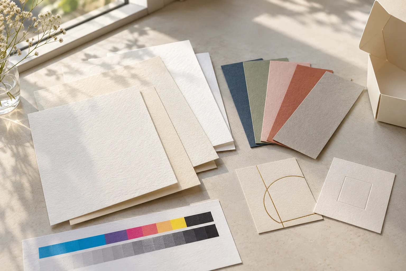
A color mismatch can involve the file?s color mode, paper, coating, proofing method and viewing conditions. A monitor displays RGB light, while printing uses CMYK inks or named Pantone spot-color references. Some vivid screen colors fall outside the selected print route?s achievable result. Review the artwork conversion and a physical proof on the intended substrate and finish rather than assigning every mismatch to color mode.
Two rules save you here:
- Design in CMYK from the start so what you see is closer to what prints. If you design in RGB and convert late, expect surprises.
- For any brand-critical colour, specify a Pantone (PMS) code — e.g. "logo in PMS 877 C silver." A named spot-color reference defines a target, but paper, ink and finish still affect the result. Approve the physical combination rather than treating the code as a guarantee across runs.
Then always approve a physical proof for colour-sensitive work. A screen — or your office inkjet — is not a reliable preview of an offset-printed, laminated box. (More on print colour control in our gift box printing guide.)
For the approval chain after artwork setup, use the custom packaging color-matching workflow to connect substrate, finish, physical proof, signed reference and production acceptance.
Special Finishes Need Their Own Layers
Foil stamping, spot UV, embossing and debossing are not "printed" in the normal sense — they're separate production steps that need their own tooling. The factory has to know exactly where each one goes, and the way you communicate that is with a dedicated layer:
- Put each finish on its own named layer — e.g. "GOLD FOIL," "SPOT UV," "EMBOSS."
- Mark the finish areas as a solid spot colour (100% of a named swatch), not a CMYK build, so it separates cleanly.
- Keep those layers registered exactly over the artwork they enhance (e.g. the foil layer sitting precisely on the logo).
Hand a factory a flat file with "make the logo gold foil" written in an email and you invite a misplaced stamp. Hand them a clean foil layer and the placement is unambiguous.
The 7 Mistakes That Cause Reprints
RGB file
Sending an RGB document guarantees a colour conversion you didn't control. Work in CMYK and name Pantones.
Live (un-outlined) fonts
The factory substitutes a font it does have, and your type reflows. Outline everything before sending.
No bleed
Artwork stopping exactly at the cut line leaves white edges when the die shifts. Extend 3–5mm past.
Ignoring fold lines
A logo placed across a crease bends and cracks. Respect the dieline's folds when you position art.
Low-res raster logo
A logo pulled off a website at 72 dpi prints fuzzy on a luxury box. Use the vector original.
Missing linked images
Linked-but-not-embedded images arrive blank. Embed or package the whole file before sending.
JPEG-only artwork
A flattened JPEG can't be colour-separated or foil-layered. It's a preview, not a production file.
No physical proof
Approving colour from a screen, then reacting to the delivered box, is how full runs get rejected. Proof first.
The Artwork Workflow, Start to Finish
- Confirm the spec. Box style, exact dimensions, material and every finish (foil, emboss, spot UV, insert) agreed with the factory.
- Request the dieline. The factory sends the exact template (usually .AI or PDF) for your box.
- Design onto the dieline. Place art within the safe zone, add bleed, respect folds and glue tabs, build finish layers.
- Prepare the file. CMYK + named Pantones, outline fonts, embed images, keep the dieline on its own locked layer. Export a layered press-ready PDF (and the .AI).
- Send & get a digital proof. The factory returns a digital mockup / proof showing your art on the 3D box. Check every panel, spelling, and finish placement.
- Approve a physical / pre-production proof for colour-critical or first orders. This is your last, cheapest chance to catch a problem.
- Mass production. Only after written proof approval. Keep the approved proof — it's your quality reference for the whole run.
No in-house designer? You're still fine. Provide your vector logo (.AI, .EPS or .SVG), your brand colours as Pantone codes, and a couple of reference images of the look you want. A full-service factory like LuxoPacks can build the artwork onto the dieline for you and send a proof to approve — you don't need to own Illustrator to get a beautifully printed box.
Need a Dieline or Artwork Help?
Tell us your box type and size and we'll send the exact dieline — or build print-ready artwork from your logo and brand colours and return a proof for approval. Free with your order.
Request a Dieline / Artwork Help
Frequently Asked Questions
What is a dieline for packaging?
A dieline is the flat, unfolded template of your box, marking exactly where it's cut, folded and glued. You design artwork on top of it so every element lands correctly once the box is assembled. Always use the exact dieline your factory provides for your box size rather than guessing dimensions.
What file format should I send for custom box printing?
Vector artwork — an Adobe Illustrator (.AI) file or press-ready PDF — placed on the factory's dieline. Set it to CMYK with named Pantone spot colours, outline all fonts, embed all images, add 3–5mm bleed, and keep the dieline on its own locked layer. Avoid sending only a JPEG or PNG.
How much bleed and safe zone does a box need?
Extend background artwork 3–5mm beyond every cut edge (bleed), and keep logos, text and critical elements at least 3–5mm inside the cut and fold lines (safe zone). Confirm the required bleed and safe-zone dimensions on the supplier’s current template; do not treat a generic allowance as approval for every structure.
Why does my printed box look different from my screen?
Screens show RGB (light); boxes are printed in CMYK ink or Pantone spot colours, a smaller colour range. Vivid RGB blues, greens and oranges shift when converted. Specify a Pantone code for brand-critical colours and approve a physical proof — never judge final colour from a screen.
Can the factory design the artwork if I only have a logo?
Yes. Provide a vector logo, your brand colours as Pantone codes, and reference images, and a full-service factory can lay out print-ready artwork on the dieline and send a proof for your approval. You don't need design software to order a well-printed box.
What is bleed and how much do I need on a box?
Bleed is background artwork extended 3–5mm beyond every cut edge, to accommodate the agreed cutting allowance. Equally important is the safe zone: keep logos, text and anything critical at least 3–5mm inside the cut and fold lines, and confirm the appropriate distances on the actual dieline.
Why does my box print look different from my screen?
Screens display colour in RGB (light); printing uses CMYK inks or Pantone spot colours. Bright RGB values — especially vivid blues, greens and oranges — cannot always be reproduced exactly in CMYK and will shift. For brand-critical colours, specify a Pantone (PMS) code and ask for a physical proof. Never judge final colour from a screen or a home printer.
LuxoPacks is a factory-direct custom packaging manufacturer in Dongguan, Guangdong, China. Use the supplier's current dieline, keep finish layers separate and approve the artwork revision before printing. LuxoPacks production starts at 500 pcs per design and size. Related reading: Gift Box Printing in China, How Much Do Custom Gift Boxes Cost, and Wholesale Packaging Sourcing Guide.
Related from the factory
- cosmetic box label rules 2026: MoCRA, INCI and PAO — What has to appear on a cosmetic carton before it ships to the US.
- what a dieline, cutting die and sampling actually cost — Which charges are one-off and which repeat on every reorder.
Put this guide into practice
Return the final file, dieline revision and approved proof as one release. Recheck affected panels after a structural change; a previous artwork approval does not automatically apply to a resized or rearranged box.