Printing Guide
📅 April 3, 2026
Supporting detail: physical proof.
When comparing gift box printing suppliers, establish who prints the wrap, who forms the board and who assembles the finished box. A quotation or platform listing may describe several businesses under one offer; request the production route and the party responsible for quality.
Print quality depends on how artwork, materials, finishing and approvals move between those steps. This guide explains the checks that make a quotation and sample useful, whether the supplier owns the equipment or coordinates subcontracted production.
Check Responsibility Across the Printing Process
Map the job from print file to wrapped box. If another site prints, laminates or stamps the paper, the approval reference still has to reach the relevant operator. Request a responsible contact and a change-control process instead of assuming that shared factory ownership prevents errors.
- Color consistency: Approve the lid and base together on the actual wrap and finish. Record the reference and acceptance method; factory ownership alone does not guarantee an exact color match.
- Schedule: Identify the queue and approval milestone for printing, coating and assembly. Compare dated schedules, not a fixed speed advantage inferred from the supplier label.
- Technical accountability: Identify who checks adhesion, print and surface defects, who receives the inspection report and who authorizes rework.
The 10-Minute Verification:
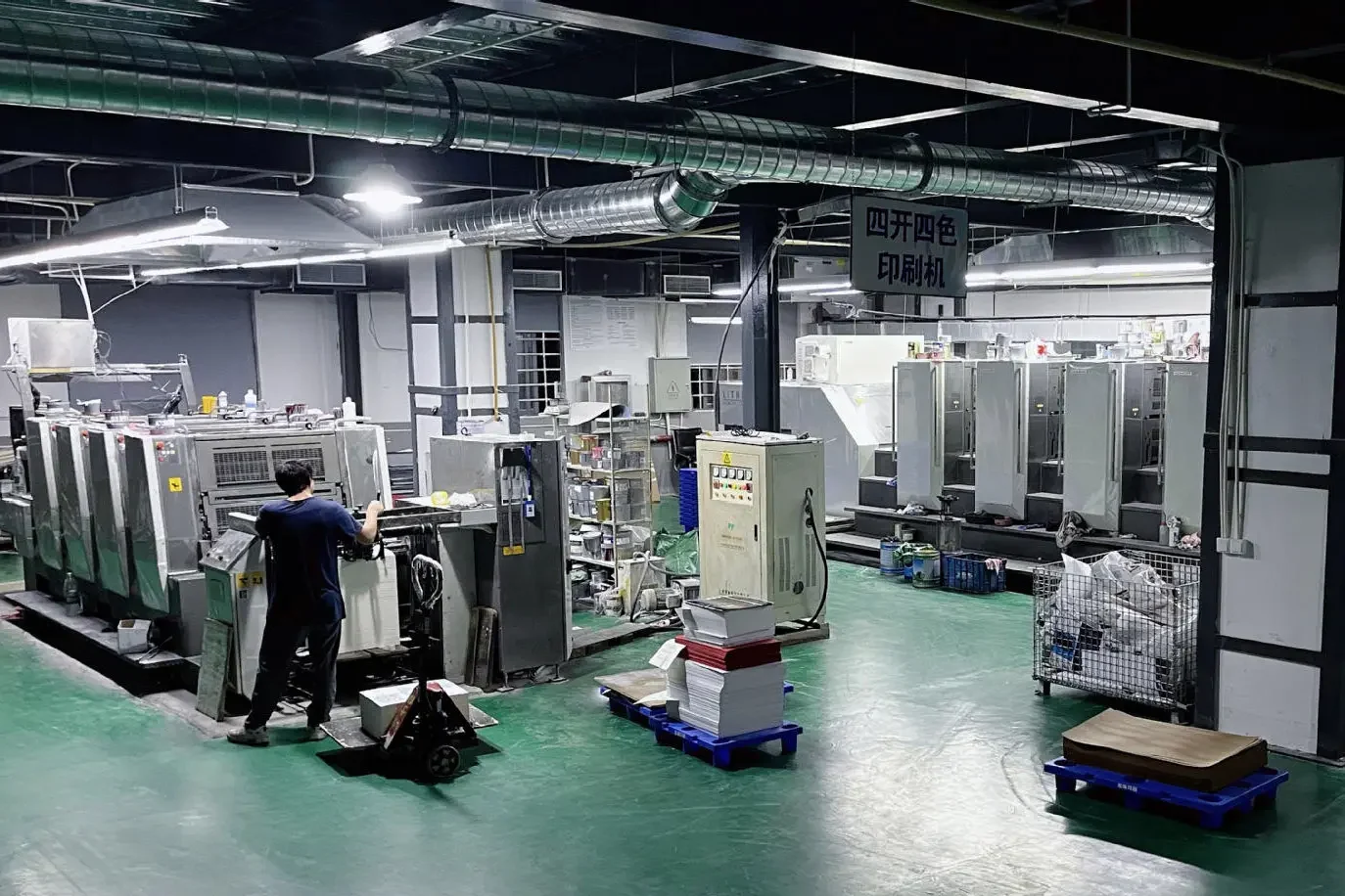
Request a live walkthrough showing the printing equipment proposed for your order, its production site and the operator's control process. Establish which company operates it and which steps are subcontracted. A brand name on a press or access to a video does not by itself prove ownership or print quality.
CMYK vs. Pantone: Choosing the Right Ink
Choose CMYK or a named spot-color route around the artwork and brand-critical areas. Photographic images and a single critical logo color create different approval questions. In both cases, judge the result on the actual paper and finish rather than treating the screen or ink name as final acceptance.
CMYK (Process Printing)
CMYK combines cyan, magenta, yellow and black to reproduce photographs and multi-color artwork. Color depends on the press setup, substrate and finish, so approve the production reference and the process used to check repeat runs.
Pantone (PMS - Spot Printing)
A named Pantone reference can define a brand-critical spot-color target. The ink still interacts with the paper, finish and printing conditions; the code alone does not guarantee identical appearance across materials. Approve a physical reference for the intended combination.
The Critical Step: Mastering the Proofing Process
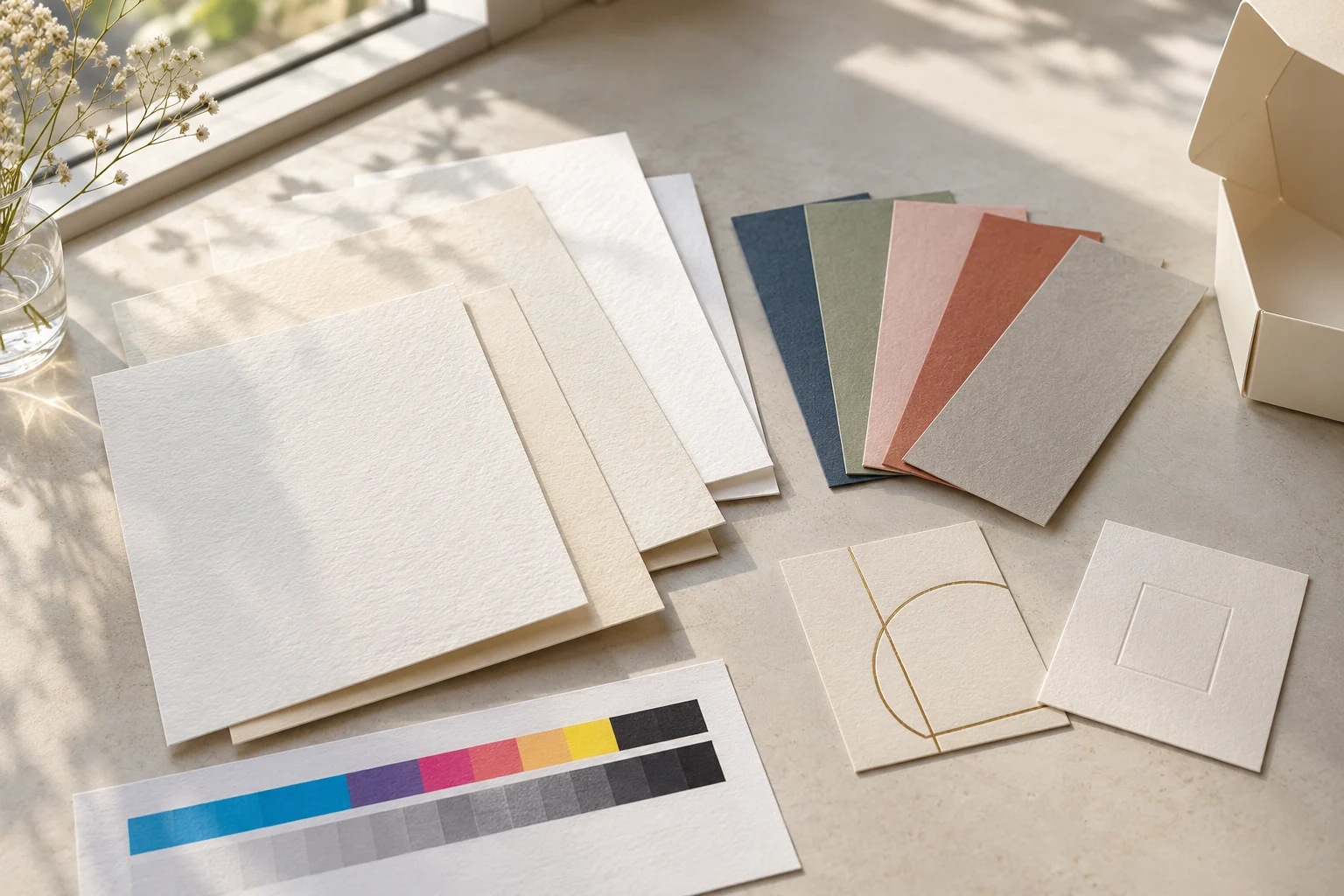
Use a PDF or screen proof for artwork layout and a physical proof for the features that a screen cannot verify. State what each proof represents before approving it.
- Screen or digital proof: Check text, panels, safe margins and artwork placement. A printed digital proof may support a color decision only when its output and reference conditions have been defined; it is not automatically equivalent to production.
- Press or production-equivalent sample: Assess the intended paper, ink and finish together. Record any difference between the sample process and bulk production, and agree how the finished run will be checked against the signed reference.
Common Color Shift Problems (And How to Avoid Them)
Even with a good printer, color shifts can happen. Here's what "nobody tells you" about why the final box looks different from the proof:
- Lamination shift: Matte and gloss finishes change reflected light and perceived color. Compare the finished sample with the approved reference rather than applying a universal percentage for darkening.
- Paper Absorption: Printing on uncoated "kraft" paper is like printing on a sponge. The ink sinks in, causing the color to look muted. Printing on "art paper" (coated) keeps the ink on the surface for a crisp look.
- Metamerism: Colors look different under different light. Your box might look perfect in a factory's LED-lit office but look "yellowish" in a store's warm retail lighting. Always check your samples under multiple light sources.
The Dieline Setup: The Foundation of Good Printing
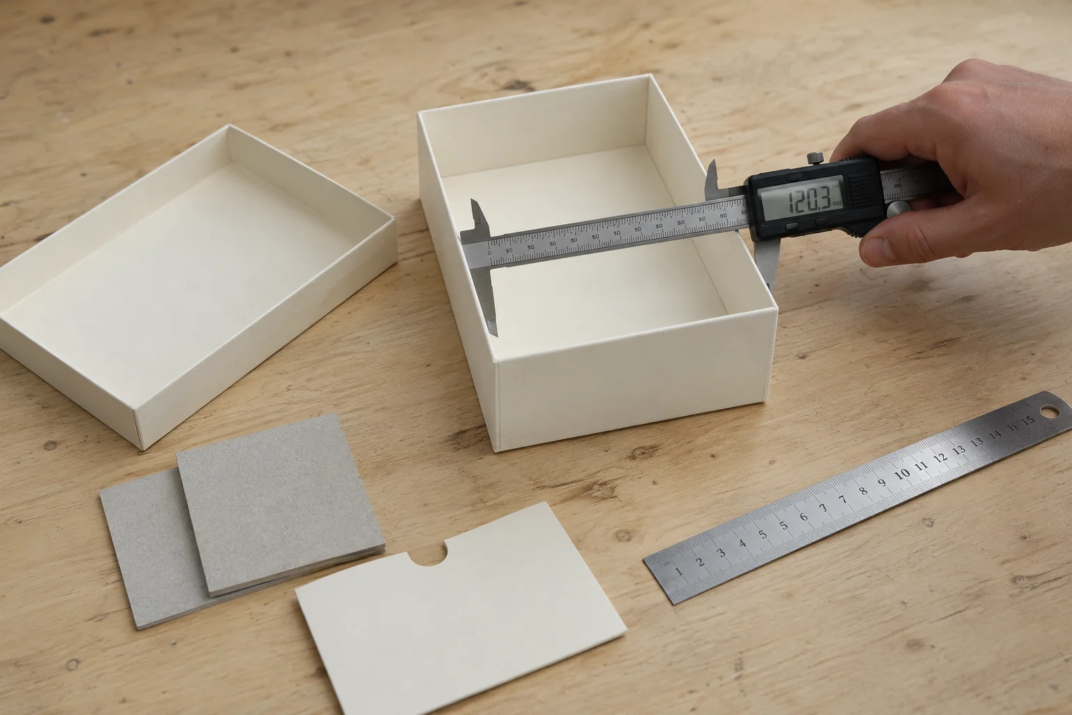
A dieline is the flat structural drawing used to position artwork around cuts, creases and wrapped edges. Use the supplier's approved revision for the exact structure and dimensions. Check panel orientation, bleed, safe zones and finish layers, then verify the assembled sample with the product.
| Check | What to request | Approval record |
|---|---|---|
| Printing route | Actual site, print process and responsibility for subcontracted steps | Named process and responsible supplier |
| Color matching | Reference, substrate, finish and viewing or measurement method | Signed physical reference and acceptance criteria |
| Setup charges | Itemized plates, dies, samples, proofs and repeat-order charges | Written quotation and agreed exclusions |
| Quality checks | Inspection stages, defect definitions, sampling and reporting | Inspection plan and release responsibility |
Why LuxoPacks is the Trusted Printer for Global Brands
LuxoPacks manufactures custom packaging in Dongguan, Guangdong. For each printing project, specify the substrate, artwork, color reference and finishing requirements, then confirm the proposed process and approval method. Request current supporting records for any certification or material claim included in the order.
Sharpen Your Print Quality Today
Email info@luxopacks.com or contact LuxoPacks on WhatsApp with your dimensions, artwork, substrate and finish requirements. Agree the dieline and proof scope before development.
Discuss the print and proof requirements by email or WhatsApp.
Frequently Asked Questions
What is the difference between CMYK and Pantone printing?
CMYK builds images from four process inks. A named Pantone spot-color reference specifies a target for a separately mixed ink. Both need a physical approval reference on the actual substrate and finish; neither guarantees identical color across all production conditions.
How do I check a gift box print proof?
First, check a digital proof (PDF) for layout and text accuracy. Second, for any serious order, request a 'wet proof' or a physical sample. This allows you to verify the actual color, texture, and lamination effect on the final paper material before you commit to a full bulk run.
Why do colors shift between a computer screen and the final box?
Computer screens use light (RGB) to display color, while printing uses physical ink (CMYK/PMS). Furthermore, the type of paper (coated vs. uncoated) and the lamination (matte vs. gloss) dramatically change how the eye perceives the ink. Always use a Pantone bridge book to check physical colors rather than relying on a monitor.
Related from the factory
- factory direct vs online design platforms — Where the markup sits when you buy through a design platform.
Put this guide into practice
Release the artwork revision, approved color reference and finishing layers as one controlled package. Confirm how discrepancies are handled before the printed sheets move into assembly.